Prologue
Look, I’m a reasonable guy. Everyone makes mistakes – myself most of all – so I don’t expect anything in life to be perfect. Except, well…
I do expect large corporations to do a couple of once-overs on their documents before they push them to the public to ensure that there are no weird linguistic or formatting errors. All I’m asking is for documents presented by any organization larger than, say, ten people, to be utterly perfect.
Hmm, maybe I’m not so reasonable.
Before I continue, I’ll add a life-saving disclaimer that most of this is in jest. With that being said, I do notice this lack of proofreading presented by companies. Heck, when I was hired on at my job, I was given a book of corporate procedures to read. Later, I was asked if I had any questions or concerns about these procedures – in return, I gave them several pages of extremely mild formatting errors that I had discovered. In my mind, the ever-so-slight differences in formatting and verbiage throughout the book lent it a feeling of mild carelessness – not so much from any one person, just as a general vibe.
In my defense, I think pulling this sort of stunt might be why they hired me into a Compliance role in the first place and, in my coworker’s defense (the one who compiled the book), each self-contained procedure was written very cohesively. It was only after compilation that cracks showed through, and was only likely to be caught by someone actually reading through the whole thing in one sitting.
Is this annoying? Yes, but this is just how my brain works, apparently. You know, if I have to see these errors, then why not point them out to everyone else as well? People love it when I point out proofreading errors. Ask me how I know.
Note that this will likely be an ongoing series as I find things. Why not? Nobody reads this stuff anyway =)
weather.gov
Recently, for work, I’ve been having to crunch some weather data. Thankfully, weather.gov has a cohesive guide on calculating wind chill here. I found this document to be a short, but very distracting read. Here’s why:

Notice how the left side of the “0.16” overlaps with the top-right of the “d” in “Wind”? Drives me wild. And before anyone says “That’s just how LaTeX be, bro,” well, I decided to write it out in both MS Office’s equation editor (the rest of the document is written in Calibri, so we know that it’s an MS Word document) and in pure LaTeX. Here is what I got:

In neither case does the “0.16” overlap the word “Wind.” I will, however, hazard a guess as to what caused this problem: I find it extremely unlikely that the writers at weather.gov would be careless enough to let some formatting errors slip in, yet also be caring enough to go out of their way to install a new, worse font for MS Office’s equation editor. Therefore, I have to assume that at some point Microsoft changed the baked-in font to something a little less egregious, and this document was simply written before that change occurred. There is no indication as to how old this wind chill document is, so this is my best guess.
Note: a minor nitpick, from a document control perspective, is that they absolutely should have dated this document. The wind chill formula does get updated occasionally, and they need to have some sort of reference date or rev number on their documents to help keep them under control.
This plausible deniability, however, does not save weather.gov’s writers for not having a consistent italicization of their units, however:

Unacceptable. Italicize your units, people!
And while we’re at it, as an opinion, I still believe that professional documents should be written in Times New Roman, size 12 – nothing else.

At the end of the day, the document gives good information and, really, that’s all that matters. It does, however, just exude a feeling of an internal memo – not a government organization. Though the unfortunate reality is that the NOAA likely doesn’t receive enough funding to care anyway.
Monster Energy
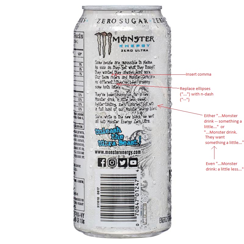
I shouldn’t be drinking these things, especially now that I know that they don’t care much about proper grammar. Granted, I’m not really in their normal clientele – I’m surrounded by more coffee drinkers. I guess the Monsters are a holdover from my construction days. It is a little upsetting that I was literally looking around my office for some more inspiration for this post, saw the can, said “I bet that’s got some” and was correct.

Also, “White is the new black”? Monster, you rascal.
Blackmagic Camera
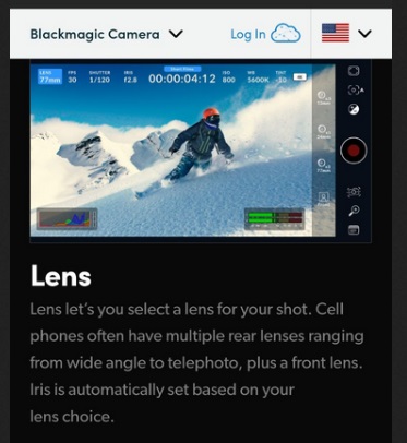
Blackmagic Design is a company that produces extremely high end assets for filmmakers. Their DaVinci Resolve software is, in my opinion, some of the best. Recently, they released an app for some Android phones that allows for using one’s phone as if it were a high-end filmmaking camera. The app itself is quite amazing, but the description of the app is less so:

Do you see it?
I’m assuming the description was written on a phone, because even I, the one who is running his mouth about formatting and grammar, will accidentally use “let’s” instead of “lets” (and similarly, “we’re” instead of “were”) because my phone’s keyboard will, for some reason, decide that I intended to use the former instead of the latter, right before I hit “send.” So, to give Blackmagic Design some plausible deniability, I’ll assume they got caught in the same trap. With that being said, they should probably be updating their websites in an actual editor, and not on a phone.
Conclusion
If you’ve made it this far, you can probably see why I didn’t have many friends as a kid. While having some strong opinions about grammar and formatting may make me seem “elitist” or “unlikeable,” I will forever stand by my guns in saying that they are extremely important in a professional setting. One or two mistakes are a given – they are unavoidable – but even you, dear reader, scoffing at my pleas, will admit that if you received a proposal for installation of extremely high-dollar technical equipment, and this proposal was littered with double-exclamation-points and “they’re” instead of “their” everywhere – well, you’d raise some eyebrows too. As it is, there exists one contractor we work with that uses Comic Sans for their logo, and that itself can be a little hard to take seriously. I can only hope that they did that ironically.
With that being said, an important rule I’ve learned with regards to being someone who notices these things is that, sometimes, it is not worth the interpersonal tension that might be created when pointing these things out. Therefore, I only attempt to rant about them at work (if it is a document that will be public-facing) or on here, apparently. In both places, you are not required to read my comments, and maybe that’s for the best.
P.S. If you agree with me on these points, then you’re cool. I had a very long conversation with my Father-in-Law recently about the importance of hyphenating your words in a center-justified text-block to avoid too much space between the letters. So, in short, he’s cool.
